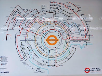
Advertising the new Samsung Galaxy phone the designers have reinvented the tube map.
The tube map was designed by Harry Beck in 1933 and eventually became a design classic. It has been added to over the years but the design has not really changed.
 |
Close up of the map and how it shows the interchanges between the lines.
I am so familiar with the original map that I wouldn't want it to change but I think there must be an award in the offing for this very clever advertising spin on the tube map.


I cant wait for this new phone to come out
ReplyDeleteIt is clever but when I published the map I mentioned that I couldn't find any of the stations I knew beyond Paddington and Kings Cross/St Pancras. I did eventually but it took some time.
ReplyDeleteMaybe the comment I just made went into the spam folder.
ReplyDeleteThey certainly seem to be spending a lot of money on advertising the new Samsung Galaxy phone!
ReplyDeleteHave to say I can still remember using the original map when I used to travel on the tube.
All the best Jan
It's interesting how "wrong" the circular map looks compared to the old familiar layout. Of course neither of them are anything like the real map. I know this because as part of my work on mental maps when I was a geography student I plotted the real routes on an OS map. The Circle Line is a titchy little scribble right in the centre, while other lines straggle aimlessly in all directions; nothing like the straight and efficient routes which the tube map suggests.
ReplyDeleteI suspect that once one gets used to one format or the other, it looks right and the other seems confusing.
ReplyDeleteWe have tv commercials on right now about the new phone, I don't need another one, mine works fine but looking at the map I can't believe how extensive all the lines are.
ReplyDeleteIt's always inspiring to see creativity flourish in unexpected places, and it's a reminder of the endless possibilities for innovation and expression in advertising and design. Thank you for sharing this intriguing discovery, and here's to celebrating creativity in all its forms!
ReplyDeleteCheck out my new post!
Clever advertising.
ReplyDeleteI struggle sometimes with the familiar map - I don't need to learn a new one lol. Interesting though but I'll stick with my iPhone for now thanks.
ReplyDelete