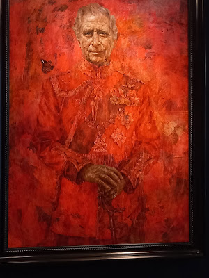
There is always controversy when a new portrait of the monarch is revealed. This is the first official portrait of King Charles III. I wasn't sure whether I liked it or not. It is a very good likeness which makes a change from some portraits of the late Queen. I then discovered that I could go and see the painting for myself as it is on display in a London Gallery before being put on permanent display in the Draper's Hall which has limited public access.
When you see it in person, you can see more of the detail and not just the redness of it. Now I have seen it, I really like it. What do you think?


I like it as it really heats up his figure there
ReplyDeleteI wasn't sure what I thought to start but have come to like it. It is a good likeness I think.
ReplyDeleteLike you said it looks to be a good likeness and isn't red a royal color?
ReplyDeleteI quite like it. The older he gets, the more he looks like his father.
ReplyDeleteI think it is a good likeness, but I'm not keen on all the red.
ReplyDeleteAll the best Jan
I'm not sure about it personally. I like the red but maybe there is a bit too much of it.
ReplyDeleteI am not a royalist, at least for Australia, but Charles and I were born in the same week. Thus I have a vested interest in his portrait looking attractive.
ReplyDeleteHe does!
It is different but quite nice.
ReplyDeleteI actually like the fact that it's not just a photo-realistic type of picture. Cheers - Stewart M - Melbourne
ReplyDeleteWhen I saw the painting for the first time, I thought poor Charles is in hell ! The painting technique of the red background is rather good, with a lot of red shades layers. The background would be a nice modern painting. But then his head looks like a photo glued on the red background. The difference of styles is too much or wanted. Honestly modern or not (I paint too) but this is not even modern, to me it doesn't belong into the Draper's Hall, it will look like a caricature. It's a funny painting, but in this case it should look a bit more serious. The painter will be famous after such a provocative painting. (maybe he should have used blue, that's a bit more "royal" ) Backgrounds are very difficult to paint.
ReplyDeleteEspecially if you have to include the uniform "ton sur ton"
ReplyDeleteI really don't know the idea behind all the red!
ReplyDelete